
So you’re thinking about getting more into the whole web design schtick? Well, it’s definitely worth revising some of the basics before you decide to dive in. Have no fear, however, because in this blog post I will be deciphering all the main necessities you need to keep in mind when designing your website.
Alignment, Margins & Rules
So let’s jump straight in. If you’ve ever done any web design work at all, then you’ll know wireframes are a must. They help you depict where the content goes and how the overall site structure will look. Now that’s all fine and dandy, but is there anything to consider if it’s just wireframes? I mean, there’s not exactly much in terms of design is there?
However, when creating a website, having a strong alignment is vital. Why? Well, that’s because it makes content easier for people to read and creates more balance between content and white space.
So how do I do that? Well, I’m glad you asked. It’s always good to set some form of guidelines in place to ensure all your content is kept clean, structured, and well presented. In the mockup below, you can see the grid lines used to help identify the margin of the website.
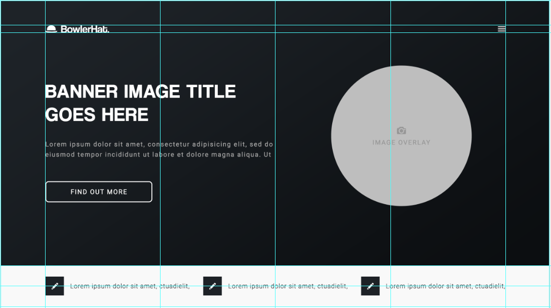
Now, this isn’t to say that everything should always be kept in the margins. This is more of a template to help make your design look neater. Things such as background shapes, images, and banners can be kind of forgotten about as these elements are more of an accent to the design, not a structural element. There are multiple guides you can download for both Sketch and Photoshop which I guarantee will help any beginner. Here are a few guideline packages:
https://hackerthemes.com/bootstrap-4-grid-psd/ (psst, this one’s good for bootstrap)
https://dribbble.com/shots/3563147-Bootstrap-4-Grid-Sketch (pssst again, here’s a good one for Sketch)
White Space
I’m starting this section by stating the obvious. White space does not actually mean a space which is white.
White space is something that can be fairly subjective. Some might say you can never have enough white space, whilst others say it makes your site look plain. Well, I personally believe you can never have too much. Long story short, white space is a good way of provoking more attention to your chosen element and making more importance to it. Take a look at this example from Squarespace.
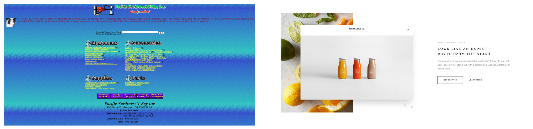 This screenshot gives a strong, clear example of how whitespace can be used to draw attention to the chosen section and suggest more importance to it. Here are a few other good examples of white space usage.
https://azulevgrupo.com/en#versatilidad
Content, and How To Keep Things Simple
Now that we’ve covered the white space, it’s probably worth mentioning copy. Copy is basically another term for the content written on the page. And although it may seem like that has nothing to do with the designer, it actually does.
Having too much copy in one area can make the page look cluttered and unreadable. If you want your section to stand out, it’s worth noting that a small paragraph of text can serve the exact same purpose as half a book’s worth of text.
Take a look at the screenshot from Squarespace again. Notice how there are only three lines of paragraph text used up? That’s because they want to provoke a message through a quick, simple paragraph so the user basically doesn’t get bored. So long story short, keep your content small.
Platforms – Expectations vs Reality
Right, let’s move on to some of the restrictions you may face. Now, if you’re a designer already and you’ve had the luxury of using WordPress, or any other CMS for that matter, then you probably know there are a fair few restrictions. However, for those uncultured in the CMS world, it’s worth noting that not everything you want to include in your design is actually possible.
WordPress, for example, is a fantastic platform to use for building any website. It offers a ridiculous number of different features, themes, plugins, and much more. But it’s not always as precise as you would like it to be. Things like background elements and site structure can vary depending on the theme you’re using, so I highly recommend looking at what system you’re going to be using before you dive into the design work.
I’ve actually written a blog post about using WordPress for beginners if you want to check it out.
The moral to this story is to always check what theme you’re going to be using before you dive into the design section. The number of problems you could face when trying to implement impossible features on a website is going to cause you a lot more work, a lot more stress, and a lot more time. So be considerate.
Actually, while we’re on the topic, here are a couple of snazzy themes for WordPress that are pretty good when it comes to customisation. However, as always, if you want quality, it comes at a price.
http://bridgelanding.qodeinteractive.com
https://avada.theme-fusion.com
Photoshop & Sketch – Which Design Software to Use?
Sketch
Let’s start with the newcomer. Sketch is relatively new in the design industry. According to Sketch’s website, the first update of Sketch was released 14th April 2014, but other sources say it was released 7th September 2010. However, don’t be fooled by its age, it’s still seriously packing some punch.
Sketch is perfect for presenting designs. With the ability to view in HTML format, you are able to view a live preview of the site in a browser window, allowing you to see more of a real-time look of the website.
In addition to this, Sketch can also be considered as a quicker platform for design as it allows you to create custom templates for your site. So instead of having to copy your “Header-1” file from document to document like you do in Photoshop, you can simply add a custom template to drop into any artboard you please.
So what else does Sketch have to offer? Well, if you’re a first-time designer, consider yourself blessed. The UI (user interface) is extremely simple to use. I can hand on heart say it took me about two days to feel confident with it. As well as this, you can also find moving from Photoshop to Sketch extremely easy as both UIs have a lot of similarities, which is a cheeky little bonus.
However, this software does have one huge drawback that all you Apple haters aren’t going to be too pleased about, and by now I can imagine you already know what it is. Yep, it’s for Mac OS only. No Windows, no Linux, just Mac OS.
According to Sketch themselves, they stated they aren’t planning on supporting any other operating system apart from Mac OS due to the “technologies and frameworks exclusive to OS X”. Because of this, only users with an Apple computing product are able to download the app, which is probably the biggest drawback for any software ever. But hey, that’s life.
Photoshop
Now, let’s have a look at the grandfather of design. Since the beginning of time itself (1990), one software has always been present (not really). Photoshop. This software has been used for the past 28 years in the design industry. And it’s pretty obvious why. Literally anything can be done in Photoshop. Web design, app design, poster design, branding, photo editing, the whole shebang.
So tell me, why use something different to Photoshop? Well, that’s entirely down to you. If you like Photoshop and you’re happy using it, then carry on as you are. Photoshop is a fantastic platform for design, offering elements including various transforming methods and 3D creation tools that you probably didn’t even know it had.
In terms of features, Photoshop dominates the market by storm. Because this software is an all-round design platform, you can create pretty much anything in it. This makes it perfect for web design as it offers everything you need for a solid design, and then some. You can create the perfect structure of your website, sprinkle it with typography, add some photo editing, and slap a spoonful of graphics you drew up on there and boom, new website design.
Now, there’s nothing saying you can’t do the exact same thing with Sketch, but at the end of the day, the platform is purely down to user preference. I’ll personally be sticking to PhotoShop (because I have windows yeehaw), but we also use Sketch at Bowler Hat, so there’s no real right or wrong with this one.
Branding Guidelines
Okay, so now all of that is out of the way, let’s focus on branding guidelines. Any business is going to have some form of branding or brand guidelines. You may have been sent from God him/herself, and have only one or two branding colours. Bangin’.
On the other hand, you may have multiple brand colours and deciding how you’re going to incorporate all 612 different variations of pink and red into your design is going to be a challenge (just keep in mind that these should be accent colours).
Basically, don’t go slapping a bright pink background on your site with lime green accents all the way through. Keep things simple. Have a white background and set one as a highlight colour and the other as an accent. We use multiple colours pretty well at Bowler Hat to help identify each service, so if you need inspiration, just fly over to our home page.
Conclusion
Right, let’s have a quick recap: alignment is key, white space is necessary, keep your copy simple, remember what CMS you’re using (if you are using one), decide what platform you’re designing on, follow brand guidelines, and, for god’s sake, don’t use Comic Sans (I’m begging you). One thing to always keep in mind, however, is that your design is never going to be perfect the first time around and changing the whole design over time is completely normal for any designer.
Hopefully, this blog gave you some insight into the whole web design thing, but for more help, download our website planning guide for a closer look at everything you need to consider when planning a website, or get in touch today to learn more about our website design services and let us do the hard design work for you.
